Why Simpler Dashboards Drive Better Decisions
In a world overflowing with data, dashboards are supposed to make life easier. But in many cases, they do the opposite.
Organizations build dashboards packed with charts, metrics, and filter options to provide more insights. Instead, users feel overwhelmed, confused, and unsure of what really matters.
This is the hidden problem of modern analytics: too much information, not enough clarity.
And that’s exactly where cognitive load in dashboard design becomes critical.
Understanding Cognitive Load (In a Practical Way)
Cognitive load is simply the mental effort required to understand information.
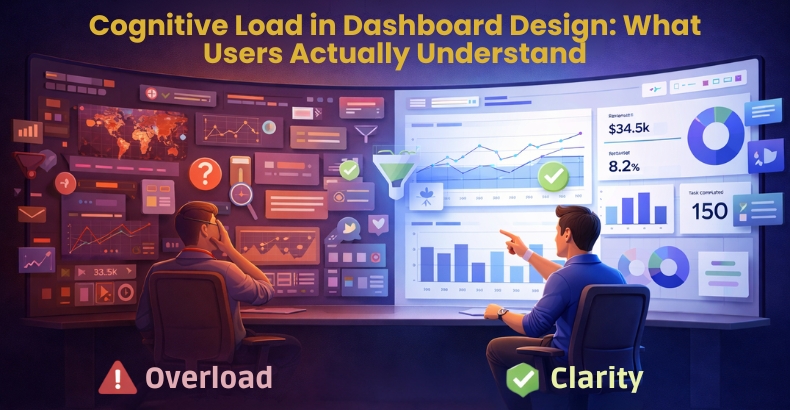
When a dashboard is clean and structured, users can instantly grasp what’s happening. But when it’s cluttered or poorly designed, the brain has to work harder, slowing down decisions and increasing confusion.
In the context of business intelligence dashboard design, this means one thing:
If users have to think too much, the dashboard is already failing.
The Real Problem with Most Dashboards

Let’s be honest: most dashboards are designed to show everything, not explain anything.
Common patterns you’ll notice:
- Too many visuals competing for attention
- Bright, inconsistent colors that distract more than help
- Complex charts where simple ones would work better
- No clear starting point for the user
- Important insights buried under less relevant data
All of this increases cognitive load in UX design, making dashboards harder to use even if the data is accurate.
What Users Actually Want from a Dashboard
Here’s the reality: users don’t open dashboards to explore; they open them to get answers quickly.
Within seconds, they want to understand:
- What is happening right now?
- Whether something is going wrong
- How performance is changing over time
- What action they should take next
This is the foundation of effective data visualization: not more data, but clear direction.
Designing Dashboards That Reduce Cognitive Load

Good design is not about removing data; it’s about reducing friction between the data and the user.
Here’s how you can apply data visualization best practices effectively:
✔ Prioritize What Matters
Not everything deserves equal attention. Highlight the most important KPIs first.
✔ Build a Clear Visual Hierarchy
Guide the user’s eye naturally from summary to details.
✔ Keep It Consistent
Consistent colors, fonts, and layouts reduce mental effort.
✔ Use Simple, Familiar Charts
- Bar charts → comparisons
- Line charts → trends
- KPI cards → quick understanding
Avoid complexity unless it adds real value.
✔ Use Color Intentionally
Color should signal meaning (good, bad, alert), not decoration.
✔ Structure Information Logically
Group related data so users don’t have to search or guess.
The Business Impact of Better Dashboard Design
Reducing cognitive load is not just a design improvement; it directly impacts how organizations perform.
When dashboards are easy to understand:
- Decisions are made faster.
- Teams trust the data more.
- Adoption of dashboards increases
- Productivity improves
- Errors and misinterpretations decrease
In short, clarity drives performance.
Simplicity vs. Depth: Finding the Right Balance

One common misconception is that simpler dashboards mean less information.
But the goal is not to remove data; it’s to present it in layers:
- Start with key insights
- Allow users to drill down if needed
This approach keeps dashboards simple on the surface while still being powerful underneath.
Conclusion
A dashboard is only as effective as its ability to communicate.
By focusing on cognitive load in dashboard design, organizations can transform overwhelming data into clear, actionable insights. It’s not about adding more visuals; it’s about making every element meaningful.
When you apply strong data visualization best practices, your dashboards become faster to understand, easier to use, and far more impactful for decision-making.
Because in the end, the best dashboards are not the ones with the most data.
They are the ones users understand instantly.