Data Storytelling in the Age of Short Attention Spans
In a world where people scroll, swipe, and skim, grabbing and holding attention has never been harder. Whether you’re a marketer, analyst, or business leader, the challenge is clear: How do you convey critical data insights to an audience that barely has time to listen?
Welcome to the age of data storytelling, where facts meet narrative, and dashboards transform from charts into conversations. But in today’s hyper-connected world, data storytelling needs to adapt to one harsh reality: attention spans are shrinking.
Why Traditional Dashboards Don’t Cut It Anymore
A decade ago, a dashboard with complex KPIs and dozens of charts might have impressed leadership. Today, it risks being ignored.
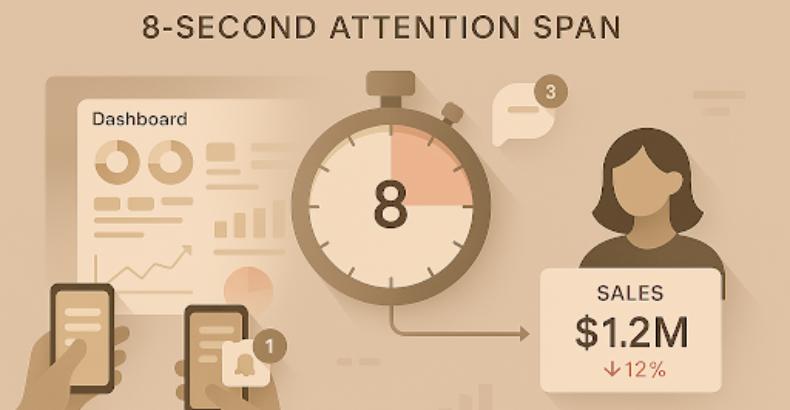
- Endless charts = cognitive overload
- 8-second average attention span (shorter than a goldfish!)

- Long reports feel like digital noise
In short: Data overload kills insights.

What’s needed now is clarity, brevity, and narrative flow. Data storytelling isn’t just a nice-to-have; it’s a survival skill for communicating with modern audiences.
What Is Data Storytelling?
Think of data storytelling as the art of turning raw numbers into narratives. It blends data visualization, business context, and narrative techniques to guide your audience through insights step by step.
It’s not about simplifying or “dumbing down” your data. Instead, it’s about highlighting what matters most, in the shortest time possible, while keeping your audience emotionally and intellectually engaged.

It’s not about simplifying or “dumbing down” your data. Instead, it’s about highlighting what matters most, in the shortest time possible, while keeping your audience emotionally and intellectually engaged.
Tactics for Storytelling in a Distracted World
Here’s how to master data storytelling for people who don’t have time to listen:
1. Lead with the “So What?”
Don’t save the insights for the last slide. Start with your main takeaway upfront:
“Sales dropped 12% last quarter. Here’s why.”
Audiences today expect clarity in the first few seconds. Think headlines, not long intros.

2. Use Data Visuals, Not Data Dumps
Replace dense tables with:
- Simple, clean charts
- KPI cards showing top metrics
- Color-coded trends for immediate understanding
Remember: A good visual tells a story in 3 seconds or less.
3. Narrate the Why, Not Just the What
Don’t just report what happened; explain why it matters. Frame your charts as parts of a story:
- Revenue dropped after product recalls in Europe.
- User churn increased after a pricing change.
Context creates meaning.
4. Design for Scanning, Not Reading
People skim dashboards like web pages. Use:
- Clear section headings
- Bold numbers and highlights
- Consistent layouts
- Minimalist design (less is more)
Make every page scannable in seconds.
5. Use Animation and Interactivity (Sparingly)
Dynamic visuals, scrolling effects, or interactive filters can engage users but avoid overusing them. Use motion to highlight key changes or transitions in your data narrative.
Real-World Example: A 60-Second Story
Instead of a 10-page deck, imagine showing a one-page dashboard:
- KPI Card: “Sales down 12%” (Red indicator)
- Line Chart: Sales trends drop over past 4 months
- Map: Drop concentrated in Europe
- Annotation: “Linked to recent product recall”
That’s it. Insight delivered in 60 seconds.

The Human Brain Loves Stories
Our brains are wired for stories, not spreadsheets. When you craft your dashboards as narratives with a beginning, middle, and end, you make your insights memorable and actionable.
Storytelling in data isn’t just about engagement. It’s about changing minds and driving action.
Final Thoughts: Less Data, More Story
By focusing on simplicity, narrative, and emotional clarity, you can transform your dashboards into powerful data stories that cut through the noise.
Remember: Insights don’t drive action; stories do.