
In today’s data‑driven world, businesses generate massive amounts of information every single day. But raw numbers alone rarely inspire action. That’s where data visualization becomes powerful. Done right, it transforms complex datasets into clear, meaningful insights that decision‑makers can quickly understand and act upon.
Whether you’re working with Microsoft Power BI, Tableau, or Microsoft Fabric, following the right visualization practices ensures your dashboards are not just attractive but also business‑focused and actionable.
Why Data Visualization Matters
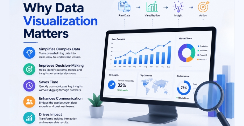
A well‑designed chart can convey information that would take hundreds of spreadsheet rows to explain. Instead of overwhelming leaders with endless reports, visualization provides a clear snapshot of performance and highlights the areas that truly matter.
Key benefits include the following:
- Faster identification of trends and opportunities
- Improved decision‑making through simplified insights
- Easier communication of complex reports
- Real‑time KPI tracking for agility
- Clear storytelling across teams and departments
Modern organizations now rely on data visualization and storytelling to drive alignment and action.
Data Visualization Best Practices
1. Understand Your Audience
Executives need high‑level KPIs, managers want operational reports, and analysts prefer detailed datasets. Dashboards that lack audience-specific tailoring risk irrelevance. Always ask, “Who will use this dashboard, and what decisions will they make with it?”
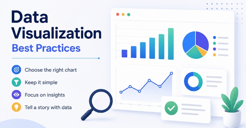
2. Choose the Right Chart
Charts are tools, and using the wrong one can mislead or confuse.
Best Chart Types:
- Bar Charts → Compare categories (e.g., revenue by region)
- Line Charts → Show trends over time (e.g., monthly growth)
- Scatter Plots → Reveal relationships (e.g., ad spend vs. conversions)
- Pie Charts → Use sparingly, only for simple proportions
A well‑chosen chart makes insights obvious at a glance, while a poor choice hides the story.
3. Keep It Clean and Simple
Cluttered dashboards overwhelm users and dilute the message. A clean design ensures the focus remains on insights, not decoration.
Practical techniques:
- Use minimal colors to avoid distraction.
- Remove unnecessary elements like extra gridlines or 3D effects
- Keep layouts balanced and easy to scan
- Highlight only the most important metrics
In 2026, clarity is valued far more than flashy visuals.
4. Use Colors Strategically
Colors should guide the eye and reinforce meaning. A consistent palette builds trust and makes dashboards look professional.
Best practices:
- Green → Positive performance
- Red → Risks or decline
- Blue → Neutral insights
When used correctly, colors act like signposts, directing attention to what matters most.
5. Tell a Story with Data
Numbers alone don’t inspire action. Dashboards should explain not just what happened, but also why it happened and what should happen next.
For example:
- “Sales Increased”
- “Sales Increased 22% Due to Higher Customer Retention.”
This storytelling approach transforms dashboards into decision‑making tools rather than static reports.
6. Focus on Real‑Time Insights
Static reports are fading. Businesses now rely on real‑time dashboards to monitor performance and respond instantly. Platforms like Microsoft Power BI and Microsoft Fabric empower organizations to track live KPIs, make faster decisions, and stay agile in dynamic markets.
Real‑time insights mean leaders don’t just react; they anticipate and act proactively.
Real‑World Example
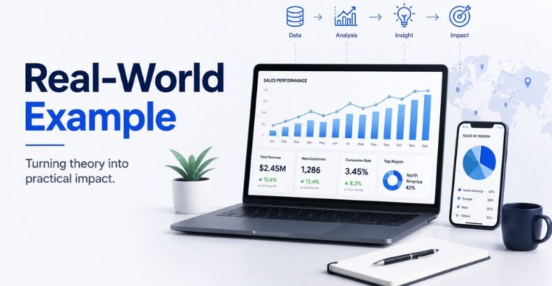
Imagine a retail chain tracking customer footfall. Instead of 15 cluttered charts, a clean dashboard with:
- A line chart showing daily footfall trends
- A bar chart comparing store performance
- A KPI card highlighting conversion rates
…tells a clear story: which stores are thriving, which need attention, and what actions should follow. This clarity helps managers act quickly and effectively.
Final Thoughts
Great data visualization is not about flashy charts; it’s about clarity, honesty, and storytelling. By following these best practices, businesses can transform raw data into actionable narratives that drive growth.
The future of BI lies in real‑time, audience‑focused, and story‑driven dashboards. When numbers become narratives, decisions become smarter and organizations become more agile, competitive, and successful.
FAQs
Data visualization transforms complex data into clear, actionable insights, helping organizations identify trends, track KPIs, and make faster business decisions.
Businesses can create effective visualizations by understanding their audience, selecting the right charts, keeping dashboards simple, using colors strategically, and focusing on storytelling.
Choosing the right chart makes insights easier to understand, helping users compare data, identify trends, and interpret relationships more accurately.
Data storytelling explains not only what happened but also why it happened, making dashboards more meaningful and supporting better decision-making.
Real-time dashboards provide up-to-date insights that help organizations monitor performance, respond quickly to changes, and make proactive business decisions.